Reacting
Terminology
- Reaction: A reaction is a user's interaction with a piece of content or object. It may be binary (Instagram, TikTok-style) or "multi" (Facebook, Reddit-style)
- Reaction Type: A reaction type is a configuration that defines what UI options a user will be presented with for interaction with posts or objects. It defines which reactions are available, what the UI looks like, and where the defined reactions should appear/be available.
Reactions Settings
General
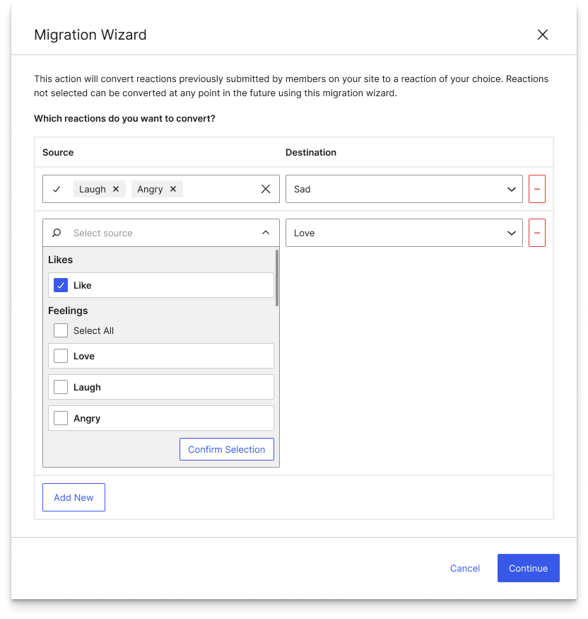
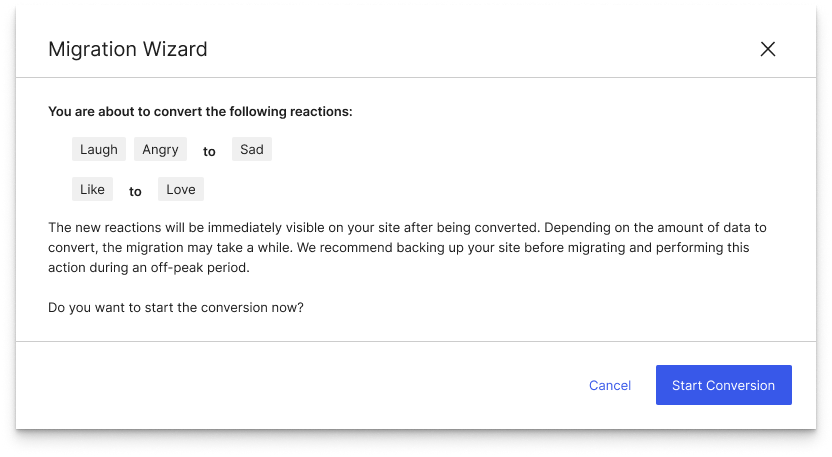
In the general settings for a reaction type, users can enable or disable the reaction type (essentially toggling it between draft and publish modes), Provide a Label for the Reaction Type, select whether the reaction type is binary or multi (PRO ONLY), and make use of the built-in reaction migration wizard.
Content Management
The content management section provides Checkbox UIs to determine what content can be liked by which users:
- Enable reaction for post types: Any publicly queriable post type registered on the site will appear in this list. An "All Post Types" checkbox allows bulk selection of all available options.
- Enable reaction for user types: Any user role registered on the site will appear in this list. An "All User Types" checkbox allows bulk selection of all available options.
- Show to logged out users: This option determines whether the reaction UI is accessible to and usable by non-authenticated users. Logged out users' reactions will be stored on the post, but will have no user association.
- Algolia integration: The Algolia integration setting will determine whether the reactions are sent through to Algolia to be used for sorting and filtering purposes. These options should only appear if tangible-algolia-plugin (or a client-specific fork) is activated on the site. When the integration is enabled for a post type updates will be sent to Algolia to reflect changes to the reaction count/list on a post or other object.
- Anonymize reactions: When this option is enabled users will not be associated with their likes. Their liked posts will be stored as cookies in their browser instead of in the site's database. (PRO ONLY)
Reaction Button
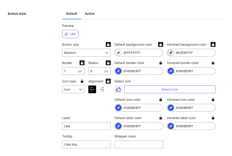
The Reaction Button section provides settings to customize the frontend appearance of the reaction button.
- Button wrapper and wrapper class: the button wrapper option allows selection of the HTML tag that will be used to wrap the reaction action. The wrapper class option allows the user to add a space-separated list of classnames that will be applied to the wrapper on the frontend. The available options for Button wrapper are:
[Button:default|Anchor (a)|Div|Span] - Button type: allows the user to customize what elements appear on the reaction button.
[Icon and Text:default|Icon Only|Text Only]. When set to Icon-only mode, the button text should still appear in the DOM as an aria-label or visually-hidden span. - Button Style: button styles can be adjusted for Default (no reaction) and Active (has reaction) states. Each styling setting (as opposed to content settings) can be locked with an icon button to make its value match between the Default and Active state tabs. When the lock icon is selected for an option it will be set to
disabledin the Active state tab. Each tab contains the following settings:- Button size: alters a sizing modifier classname on the reaction button wrapper
[Extra-Small|Small|Medium:default|Large|Extra-Large] - Border: styles
border-widthvalue on button wrapper - Radius: styles
border-radiusvalue on button wrapper - Icon type: determines which icon selection modal is opened by "Select icon" option
[Icon|Emoji|Custom] - Alignment (icon): determines DOM order of icon and text
- Default background color: styles
background-colorvalue on button wrapper - Default border color: styles
border-colorvalue on button wrapper - Hovered background color: styles
background-colorvalue on button wrapper when hovered - Hovered border color: styles
border-colorvalue on button wrapper when hovered - Icon: The icon field displays the currently selected reaction icon, and contains a button that opens the appropriate icon selection modal based on the Icon Type selection
- Default icon color: styles the
color/fillvalue on the icon svg element. Not applicable to emoji-type icons - Hovered icon color: styles the
color/fillvalue on the icon svg element when the wrapper button is hovered. Not applicable to emoji-type icons - Default label color: styles the
colorvalue of the label element - Hovered label color: styles the
colorvalue of the label element when the wrapper button is hovered - Label: defines the react action label text
- Tooltip: defines the text in the tooltip displayed when the wrapper button is hovered
- Wrapper class: defines state-specific wrapper classes input as space-separated list
- Button size: alters a sizing modifier classname on the reaction button wrapper
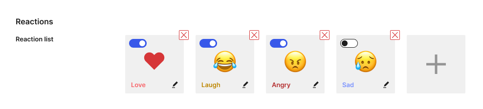
Multi-reaction handling
The multi-reaction list allows the user to add between 1 and 10 reactions. Ordering in the list impacts ordering in the frontend. Each item in the list supports removal, toggle active state (untoggled items will be omitted from the frontend), and edit actions.
Button settings

Button styles
Icon selection modals
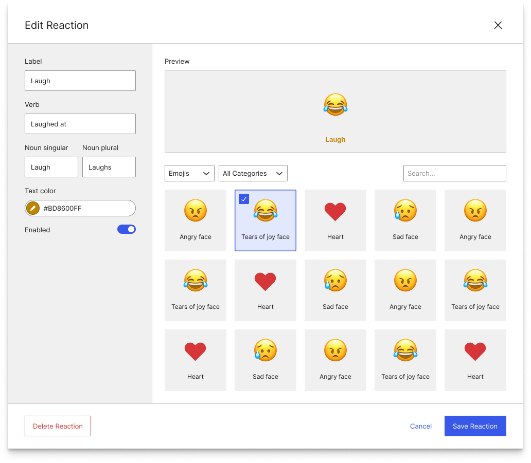
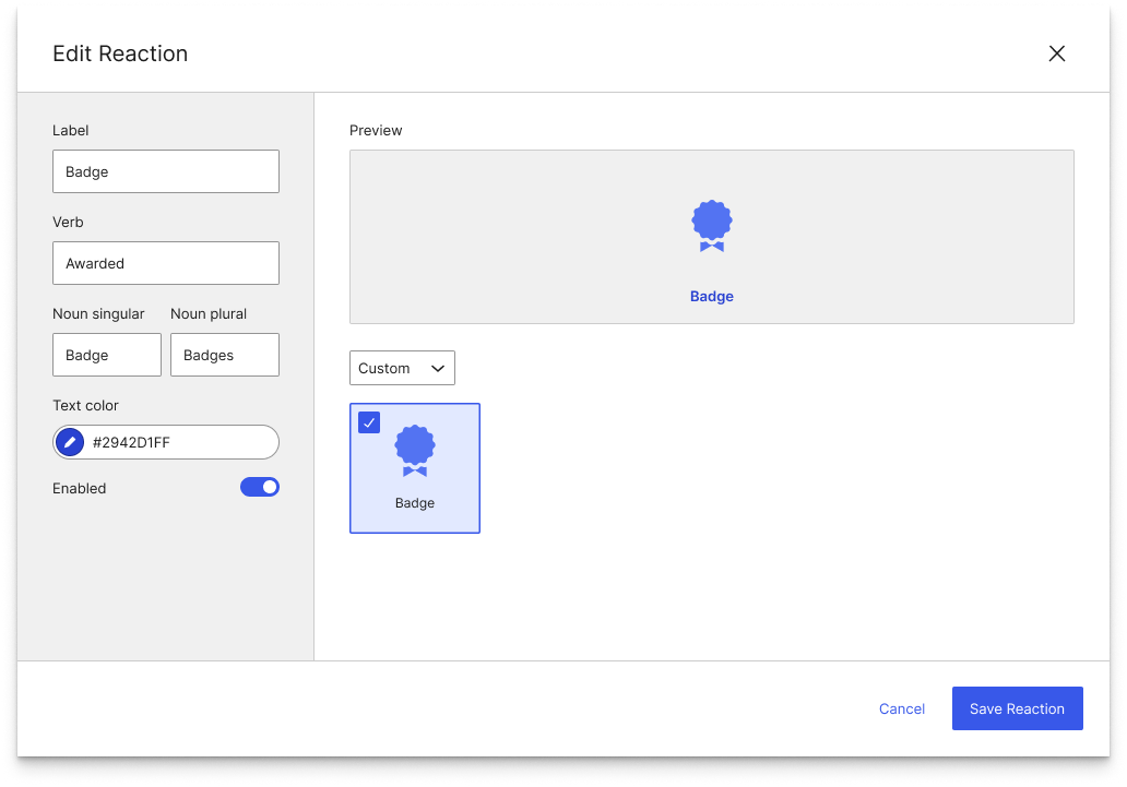
To configure icons associated with reaction button states and the multi-reaction palette, the user will make use of a WP Media Library-esque modal UI to select and configure reactions.
Emojis
(use this as data source?)
Icons
Custom
Reaction migration tool
The system will support migration of old to new reactions so that user interaction data isn't lost if the multi-reaction list is updated, or one reaction type replaces another.